Edit chart
Loading graph
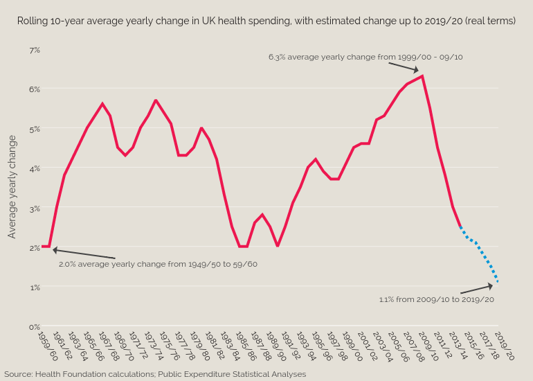
Bengershlick's interactive graph and data of "Rolling 10-year average yearly change in UK health spending, with estimated change up to 2019/20 (real terms)" is a scatter chart, showing Average increase over last 10 years vs Estimated; with Average yearly change in the y-axis. The x-axis shows values from 0 to 60. The y-axis shows values from 0 to 7. This visualization has the following annotations: 6.3% average yearly change from 1999/00 - 09/10 ; 2.0% average yearly change from 1949/50 to 59/60; Source: Health Foundation calculations; Public Expenditure Statistical Analyses ; 1.1% from 2009/10 to 2019/20