Edit chart
Loading graph
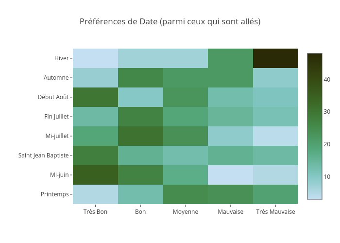
Jodymcintyre's interactive graph and data of "Préférences de Date (parmi ceux qui sont allés)" is a heatmap. The x-axis shows values from -0.5 to 4.5. The y-axis shows values from -0.5 to 7.5.