Edit chart
Loading graph
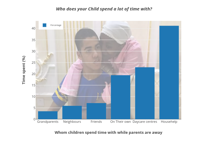
Mosemogeni's interactive graph and data of "Who does your Child spend a lot of time with?" is a bar chart, showing Percentage; with Whom children spend time with while parents are away in the x-axis and Time spent (%) in the y-axis.. The x-axis shows values from -0.5 to 5.5. The y-axis shows values from 0 to 43.36842105263158. This visualization has the following annotation: Source: University of Nairobi