Edit chart
Loading graph
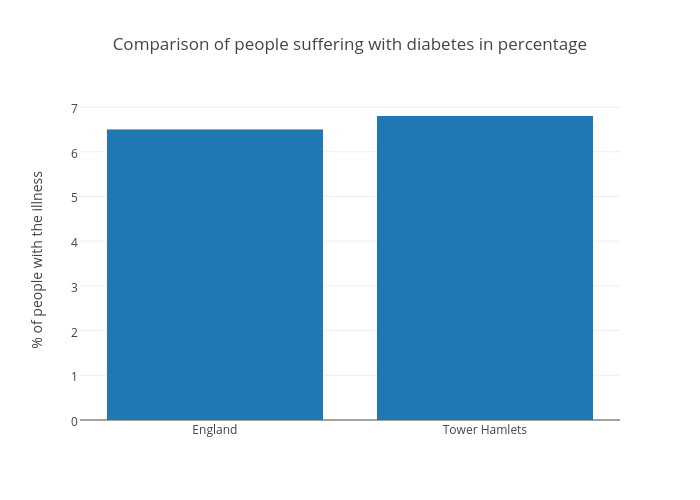
Natashachis's interactive graph and data of "Comparison of people suffering with diabetes in percentage" is a bar chart, showing A; with % of people with the illness in the y-axis. The x-axis shows values from -0.5 to 1.5. The y-axis shows values from 0 to 7.157894736842105.