Edit chart
Loading graph
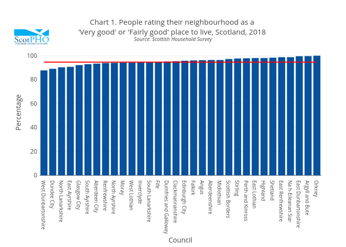
Scotpho's interactive graph and data of "Chart 1. People rating their neighbourhood as a 'Very good' or 'Fairly good' place to live, Scotland, 2018 Source: Scottish Household Survey" is a bar chart, showing Council vs Scotland; with Council in the x-axis and Percentage in the y-axis.. The x-axis shows values from 0 to 0. The y-axis shows values from 0 to 0.