Edit chart
Loading graph
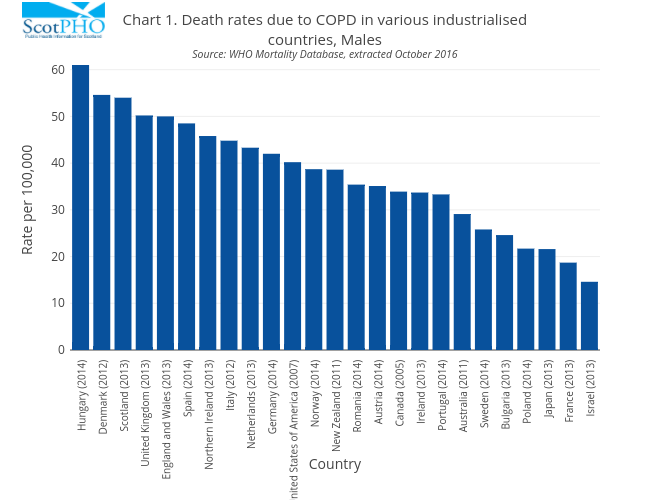
Scotpho's interactive graph and data of "Chart 1. Death rates due to COPD in various industrialisedcountries, MalesSource: WHO Mortality Database, extracted October 2016" is a bar chart; with Country in the x-axis and Rate per 100,000 in the y-axis.. The x-axis shows values from 0 to 0. The y-axis shows values from 0 to 0.