Edit chart
Loading graph
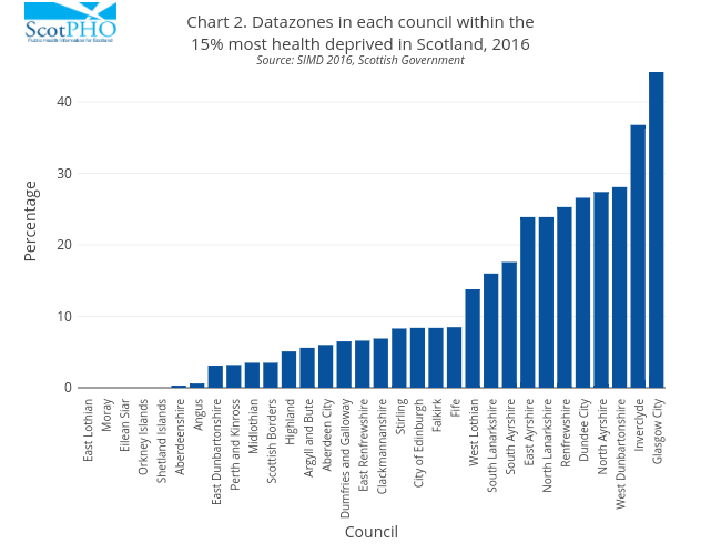
Scotpho's interactive graph and data of "Chart 2. Datazones in each council within the15% most health deprived in Scotland, 2016Source: SIMD 2016, Scottish Government" is a bar chart; with Council in the x-axis and Percentage in the y-axis.. The x-axis shows values from 0 to 0. The y-axis shows values from 0 to 0.