Edit chart
Loading graph
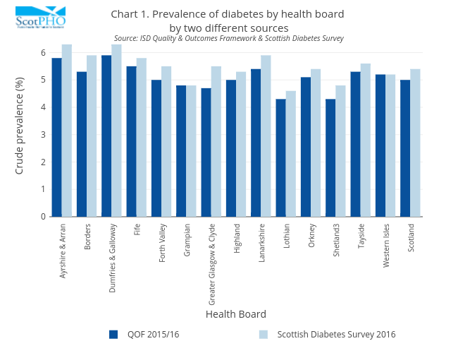
Scotpho's interactive graph and data of "Chart 1. Prevalence of diabetes by health board by two different sourcesSource: ISD Quality & Outcomes Framework & Scottish Diabetes Survey" is a bar chart, showing QOF 2015/16 vs Scottish Diabetes Survey 2016; with Health Board in the x-axis and Crude prevalence (%) in the y-axis.. The x-axis shows values from -0.5 to 14.5. The y-axis shows values from 0 to 6.631578947368421.