Edit chart
Loading graph
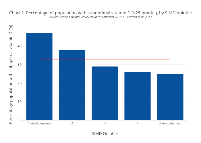
Scotpho's interactive graph and data of "Chart 2. Percentage of population with suboptimal vitamin D (Source: Scottish Health Survey adult respondents 2010-11, Purdon et al. 2013" is a bar chart, showing SIMD Quintile vs Scottish Average; with SIMD Quintile in the x-axis and Percentage population with suboptimal vitamin D (%) in the y-axis.. The x-axis shows values from 0 to 0. The y-axis shows values from 0 to 0.