Edit chart
Loading graph
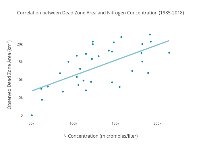
Dlmalm's interactive graph and data of "Correlation between Dead Zone Area and Nitrogen Concentration (1985-2018)" is a scatter chart, showing Dead Zone Area (km2); with N Concentration (micromoles/liter) in the x-axis and Observed Dead Zone Area (km2) in the y-axis.. The x-axis shows values from 40864.018009247986 to 223635.981990752. The y-axis shows values from -1349.2042657916322 to 24109.20426579163.