Edit chart
Loading graph
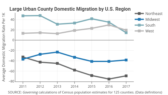
Governing's interactive graph and data of "Northeast, Midwest, South, West" is a line chart, showing Northeast, Midwest, South, West; with Average Domestic Migration Rate Per 1K in the y-axis. The x-axis shows values from 2010.555703506436 to 2017.444296493564. The y-axis shows values from -80.26176470588236 to 53. This visualization has the following annotations: Large Urban County Domestic Migration by U.S. Region; SOURCE: Governing calculations of Census population estimates for 125 counties. (Data definitions)