Edit chart
Loading graph
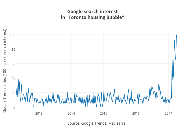
Jasonkirby's interactive graph and data of "Google search interestin "Toronto housing bubble"" is a line chart, showing B; with Source: Google Trends; Maclean's in the x-axis and Google Trends index (100 = peak search interest) in the y-axis.. The x-axis shows values from 2012-04-15 to 2017-04-09. The y-axis shows values from -5.555555555555556 to 105.55555555555556.