Edit chart
Loading graph
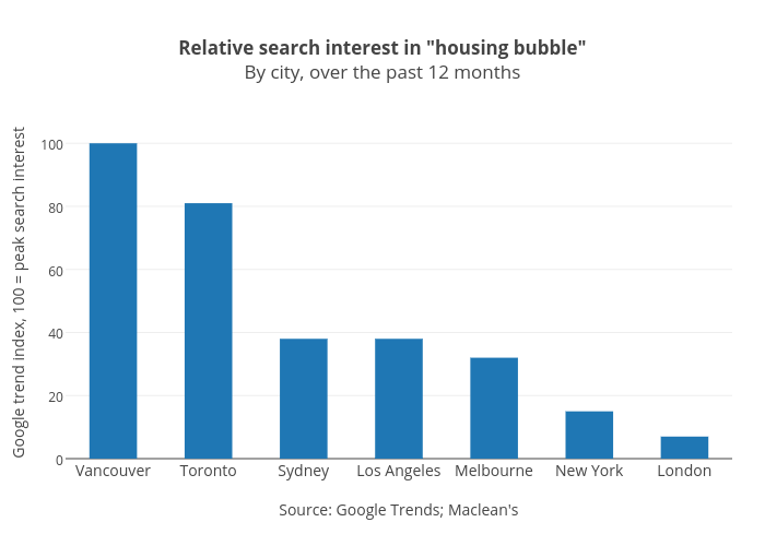
Jasonkirby's interactive graph and data of "Relative search interest in "housing bubble"By city, over the past 12 months" is a bar chart, showing B; with Source: Google Trends; Maclean's in the x-axis and Google trend index, 100 = peak search interest in the y-axis.. The x-axis shows values from -0.5 to 6.5. The y-axis shows values from 0 to 105.26315789473684.