Edit chart
Loading graph
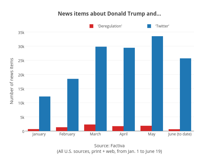
Jasonkirby's interactive graph and data of "News items about Donald Trump and..." is a bar chart, showing 'Deregulation' vs 'Twitter'; with Source: Factiva(All U.S. sources, print + web, from Jan. 1 to June 19) in the x-axis and Number of news items in the y-axis.. The x-axis shows values from -0.5 to 5.5. The y-axis shows values from 0 to 35291.57894736842.