Edit chart
Loading graph
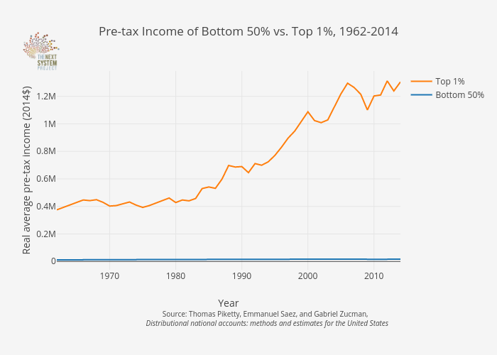
Jduda's interactive graph and data of "Pre-tax Income of Bottom 50% vs. Top 1%, 1962-2014" is a line chart, showing Bottom 50% vs Top 1%; with Year in the x-axis and Real average pre-tax income (2014$) in the y-axis.. The x-axis shows values from 1962 to 2014. The y-axis shows values from -60572.222222222204 to 1384212.2222222222. This visualization has the following annotation: Source: Thomas Piketty, Emmanuel Saez, and Gabriel Zucman, Distributional national accounts: methods and estimates for the United States