Edit chart
Loading graph
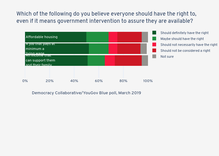
Jduda's interactive graph and data of "Which of the following do you believe everyone should have the right to, even if it means government intervention to assure they are available?" is a stacked bar chart, showing Should definitely have the right, Maybe should have the right, Should not necessarily have the right, Should not be considered a right, Not sure; with Democracy Collaborative/YouGov Blue poll, March 2019 in the x-axis. The x-axis shows values from 0 to 100. The y-axis shows values from -0.5 to 3.5. This visualization has the following annotations: An income thatcan support themand their family; A job that pays atminimum a living wage; Affordable housing