Edit chart
Loading graph
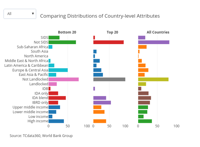
Mrpsonglao's interactive graph and data of "Comparing Distributions of Country-level Attributes" is a bar chart, showing Bottom 20, Top 20, All Countries, Bottom 20, Top 20, All Countries, Bottom 20, Top 20, All Countries, Bottom 20, Top 20, All Countries, Bottom 20, Top 20, All Countries. The x-axis shows values from 0 to 100. The y-axis shows values from -0.5 to 18.5. This visualization has the following annotations: Bottom 20; Top 20; All Countries; Source: TCdata360, World Bank Group