Edit chart
Loading graph
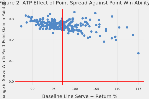
On-the-t's interactive graph and data of "Figure 2. ATP Effect of Point Spread Against Point Win Ability" is a scatter chart, showing , , ; with Baseline Line Serve + Return % in the x-axis and Change in Serve Win % Per 1 Point Gain in Point Spread in the y-axis.. The x-axis shows values from 85.9603754688671 to 116.344343244088. The y-axis shows values from -0.0166383412022553 to 0.34940516524736.