Edit chart
Loading graph
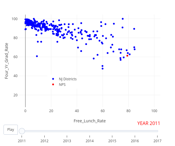
Plotlybh's interactive graph and data of "Four_Yr_Grad_Rate vs Free_Lunch_Rate" is a scatter chart, showing NJ Districts vs NPS; with Free_Lunch_Rate in the x-axis and Four_Yr_Grad_Rate in the y-axis.. The x-axis shows values from -4.9908938077893 to 104.808769963575. The y-axis shows values from 7.2115 to 104.4185.