Edit chart
Loading graph
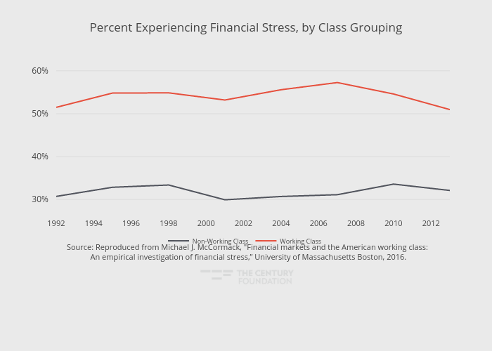
Thecenturyfoundation's interactive graph and data of "Percent Experiencing Financial Stress, by Class Grouping" is a line chart, showing Working Class vs Non-Working Class; with in the x-axis. The x-axis shows values from 1992 to 2013. The y-axis shows values from 27.401111111111113 to 61.778888888888886. This visualization has the following annotation: Source: Reproduced from Michael J. McCormack, "Financial markets and the American working class:<br> An empirical investigation of financial stress,” University of Massachusetts Boston, 2016.