Edit chart
Loading graph
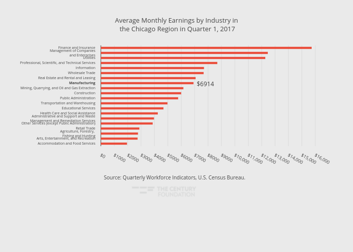
Thecenturyfoundation's interactive graph and data of "Average Monthly Earnings by Industry in the Chicago Region in Quarter 1, 2017" is a bar chart, showing A; with in the y-axis. The x-axis shows values from 0 to 16557.894736842107. The y-axis shows values from -0.5 to 19.5. This visualization has the following annotations: Source: Quarterly Workforce Indicators, U.S. Census Bureau.; $6914