Edit chart
Loading graph
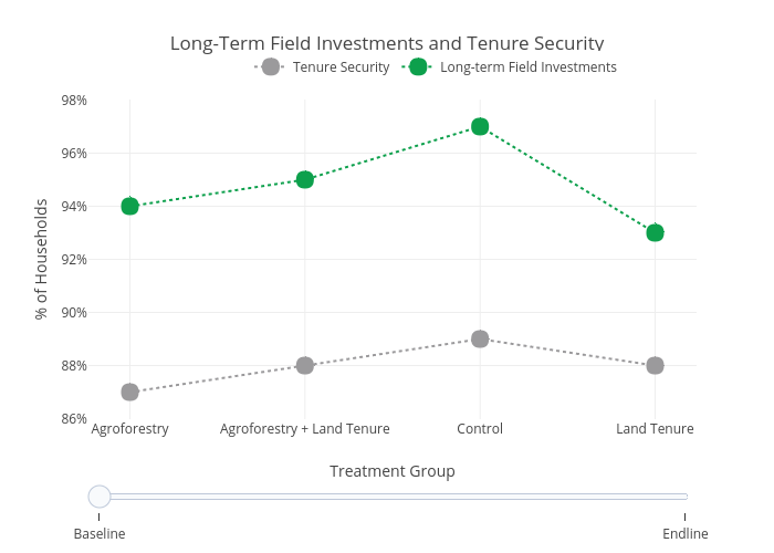
Usaidtgcc's interactive graph and data of "Long-Term Field Investments and Tenure Security" is a line chart, showing Tenure Security vs Long-term Field Investments; with Treatment Group in the x-axis and % of Households in the y-axis.. The x-axis shows values from -0.2142857142857143 to 3.2142857142857144. The y-axis shows values from 85.9000489955904 to 98.0999510044096.