

Parallel Coordinates Plot in Python
How to make parallel coordinates plots in Python with Plotly.
New to Plotly?
Plotly is a free and open-source graphing library for Python. We recommend you read our Getting Started guide for the latest installation or upgrade instructions, then move on to our Plotly Fundamentals tutorials or dive straight in to some Basic Charts tutorials.
Parallel Coordinates plot with Plotly Express
Plotly Express is the easy-to-use, high-level interface to Plotly, which operates on a variety of types of data and produces easy-to-style figures. In a parallel coordinates plot with px.parallel_coordinates, each row of the DataFrame is represented by a polyline mark which traverses a set of parallel axes, one for each of the dimensions. For other representations of multivariate data, also see parallel categories, radar charts and scatterplot matrix (SPLOM).
import plotly.express as px
df = px.data.iris()
fig = px.parallel_coordinates(df, color="species_id", labels={"species_id": "Species",
                "sepal_width": "Sepal Width", "sepal_length": "Sepal Length",
                "petal_width": "Petal Width", "petal_length": "Petal Length", },
                             color_continuous_scale=px.colors.diverging.Tealrose,
                             color_continuous_midpoint=2)
fig.show()
Parallel coordinates are richly interactive by default. Drag the lines along the axes to filter regions.
Select the columns to be represented with the dimensions parameter.
import plotly.express as px
df = px.data.iris()
fig = px.parallel_coordinates(df, color="species_id",
                              dimensions=['sepal_width', 'sepal_length', 'petal_width',
                                          'petal_length'],
                              color_continuous_scale=px.colors.diverging.Tealrose,
                              color_continuous_midpoint=2)
fig.show()
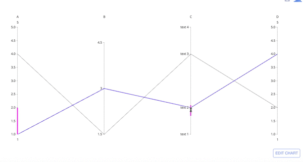
Parallel Coordinates Chart with go.Parcoords
import plotly.graph_objects as go

fig = go.Figure(data=
    go.Parcoords(
        line_color='blue',
        dimensions = list([
            dict(range = [1,5],
                 constraintrange = [1,2], # change this range by dragging the pink line
                 label = 'A', values = [1,4]),
            dict(range = [1.5,5],
                 tickvals = [1.5,3,4.5],
                 label = 'B', values = [3,1.5]),
            dict(range = [1,5],
                 tickvals = [1,2,4,5],
                 label = 'C', values = [2,4],
                 ticktext = ['text 1', 'text 2', 'text 3', 'text 4']),
            dict(range = [1,5],
                 label = 'D', values = [4,2])
        ])
    )
)
fig.show()
Parallel coordinates are richly interactive by default. Drag the lines along the axes to filter regions and drag the axis names across the plot to rearrange variables.
Basic Parallel Coordinates Plot
import plotly.graph_objects as go

import pandas as pd

df = pd.read_csv("https://raw.githubusercontent.com/bcdunbar/datasets/master/iris.csv")

fig = go.Figure(data=
    go.Parcoords(
        line = dict(color = df['species_id'],
                   colorscale = [[0,'purple'],[0.5,'lightseagreen'],[1,'gold']]),
        dimensions = list([
            dict(range = [0,8],
                constraintrange = [4,8],
                label = 'Sepal Length', values = df['sepal_length']),
            dict(range = [0,8],
                label = 'Sepal Width', values = df['sepal_width']),
            dict(range = [0,8],
                label = 'Petal Length', values = df['petal_length']),
            dict(range = [0,8],
                label = 'Petal Width', values = df['petal_width'])
        ])
    )
)

fig.update_layout(
    plot_bgcolor = 'white',
    paper_bgcolor = 'white'
)

fig.show()
Advanced Parallel Coordinates Plot
import plotly.graph_objects as go

import pandas as pd

df = pd.read_csv("https://raw.githubusercontent.com/bcdunbar/datasets/master/parcoords_data.csv")

fig = go.Figure(data=
    go.Parcoords(
        line = dict(color = df['colorVal'],
                   colorscale = 'Electric',
                   showscale = True,
                   cmin = -4000,
                   cmax = -100),
        dimensions = list([
            dict(range = [32000,227900],
                 constraintrange = [100000,150000],
                 label = "Block Height", values = df['blockHeight']),
            dict(range = [0,700000],
                 label = 'Block Width', values = df['blockWidth']),
            dict(tickvals = [0,0.5,1,2,3],
                 ticktext = ['A','AB','B','Y','Z'],
                 label = 'Cyclinder Material', values = df['cycMaterial']),
            dict(range = [-1,4],
                 tickvals = [0,1,2,3],
                 label = 'Block Material', values = df['blockMaterial']),
            dict(range = [134,3154],
                 visible = True,
                 label = 'Total Weight', values = df['totalWeight']),
            dict(range = [9,19984],
                 label = 'Assembly Penalty Wt', values = df['assemblyPW']),
            dict(range = [49000,568000],
                 label = 'Height st Width', values = df['HstW'])])
    )
)
fig.show()
Unselected Line Color and Opacity
New in 5.10
The color and opacity of unselected lines can be set with unselected. By setting opacity=0, you can hide the unselected lines. Here, we set the color to lightgray and the opacity to 0.5.
import plotly.graph_objects as go

fig = go.Figure(data=
    go.Parcoords(
        line_color='blue',
        dimensions = list([
            dict(range = [1,5],
                 constraintrange = [1,2], # change this range by dragging the pink line
                 label = 'A', values = [1,4]),
            dict(range = [1.5,5],
                 tickvals = [1.5,3,4.5],
                 label = 'B', values = [3,1.5]),
            dict(range = [1,5],
                 tickvals = [1,2,4,5],
                 label = 'C', values = [2,4],
                 ticktext = ['text 1', 'text 2', 'text 3', 'text 4']),
            dict(range = [1,5],
                 label = 'D', values = [4,2])
        ]),
        unselected = dict(line = dict(color = 'green', opacity = 0.5))
    )
)
fig.show()
Reference
See function reference for px.(parallel_coordinates) or https://plotly.com/python/reference/parcoords/ for more information and chart attribute options!
What About Dash?
Dash is an open-source framework for building analytical applications, with no Javascript required, and it is tightly integrated with the Plotly graphing library.
Learn about how to install Dash at https://dash.plot.ly/installation.
Everywhere in this page that you see fig.show(), you can display the same figure in a Dash application by passing it to the figure argument of the Graph component from the built-in dash_core_components package like this:
import plotly.graph_objects as go # or plotly.express as px
fig = go.Figure() # or any Plotly Express function e.g. px.bar(...)
# fig.add_trace( ... )
# fig.update_layout( ... )

from dash import Dash, dcc, html

app = Dash()
app.layout = html.Div([
    dcc.Graph(figure=fig)
])

app.run_server(debug=True, use_reloader=False)  # Turn off reloader if inside Jupyter
