Filled Chord Diagram in Python/v3
How to make an interactive filled-chord diagram in Python with Plotly and iGraph.
See our Version 4 Migration Guide for information about how to upgrade.
Filled-Chord Diagrams with Plotly
Circular layout or Chord diagram is a method of visualizing data that describe relationships. It was intensively promoted through Circos, a software package in Perl that was initially designed for displaying genomic data.
M Bostock developed reusable charts for chord diagrams in d3.js. Two years ago on stackoverflow, the exsistence of a Python package for plotting chord diagrams was adressed, but the question was closed due to being off topic.
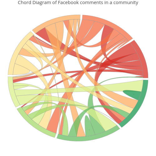
Here we show that a chord diagram can be generated in Python with Plotly. We illustrate the method of generating a chord diagram from data recorded in a square matrix. The rows and columns represent the same entities.
This example considers a community of 5 friends on Facebook. We record the number of comments posted by each member on the other friends' walls. The data table is given in the next cell:
import plotly.plotly as py
import plotly.figure_factory as ff
import plotly.graph_objs as go

data = [['', 'Emma', 'Isabella', 'Ava', 'Olivia', 'Sophia', 'row-sum'],
        ['Emma', 16, 3, 28, 0, 18, 65],
        ['Isabella', 18, 0, 12, 5, 29, 64],
        ['Ava', 9, 11, 17, 27, 0, 64],
        ['Olivia', 19, 0, 31, 11, 12, 73],
        ['Sophia', 23, 17, 10, 0, 34, 84]]

table = ff.create_table(data, index=True)
py.iplot(table, filename='Data-Table')
The aim of our visualization is to illustrate the total number of posts by each community member, and the flows of posts between pairs of friends.
import numpy as np

matrix=np.array([[16,  3, 28,  0, 18],
                 [18,  0, 12,  5, 29],
                 [ 9, 11, 17, 27,  0],
                 [19,  0, 31, 11, 12],
                 [23, 17, 10,  0, 34]], dtype=int)

def check_data(data_matrix):
    L, M=data_matrix.shape
    if L!=M:
        raise ValueError('Data array must have (n,n) shape')
    return L

L=check_data(matrix)
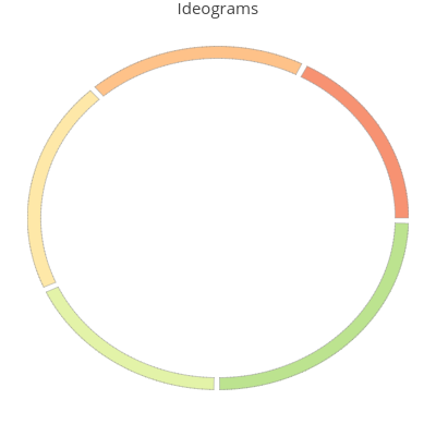
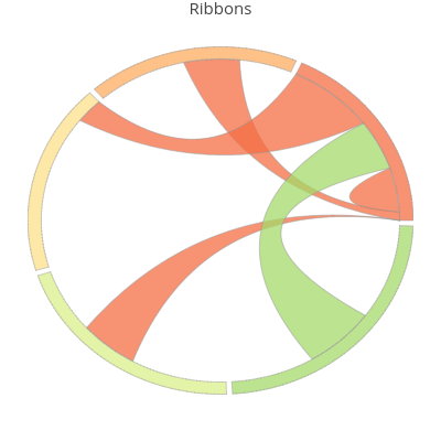
A chord diagram encodes information in two graphical objects:
- ideograms, represented by distinctly colored arcs of circles;
- ribbons, that are planar shapes bounded by two quadratic Bezier curves and two arcs of circle,that can degenerate to a point;
Ideograms
Summing up the entries on each matrix row, one gets a value (in our example this value is equal to the number of posts by a community member).
Let us denote by total_comments the total number of posts recorded in this community.
Theoretically the interval [0, total_comments) is mapped linearly onto the unit circle, identified with the interval $[0,2\pi)$.
For a better looking plot one proceeds as follows: starting from the angular position $0$, in counter-clockwise direction, one draws succesively, around the unit circle, two parallel arcs of length equal to a mapped row sum value, minus a fixed gap. Click the image below:
Now we define the functions that process data in order to get ideogram ends.
As we stressed the unit circle is oriented counter-clockwise.
In order to get an arc of circle of end angular
coordinates $\theta_0<\theta_1$, we define a function moduloAB that resolves the case when an arc contains
the point of angular coordinate $0$ (for example $\theta_0=2\pi-\pi/12$, $\theta_1=\pi/9$). The function corresponding to $a=-\pi, b=\pi$ allows to map the interval $[0,2\pi)$ onto $[-\pi, \pi)$. Via this transformation we have:
$\theta_0\mapsto \theta'_0=-\pi/12$, and
$ \theta_1=\mapsto \theta'_1=\pi/9$,
and now $\theta'_0<\theta'_1$.
PI=np.pi

def moduloAB(x, a, b): #maps a real number onto the unit circle identified with
                       #the interval [a,b), b-a=2*PI
        if a>=b:
            raise ValueError('Incorrect interval ends')
        y=(x-a)%(b-a)
        return y+b if y<0 else y+a

def test_2PI(x):
    return 0<= x <2*PI
Compute the row sums and the lengths of corresponding ideograms:
row_sum=[np.sum(matrix[k,:]) for k in range(L)]

#set the gap between two consecutive ideograms
gap=2*PI*0.005
ideogram_length=2*PI*np.asarray(row_sum)/sum(row_sum)-gap*np.ones(L)
The next function returns the list of end angular coordinates for each ideogram arc:
def get_ideogram_ends(ideogram_len, gap):
    ideo_ends=[]
    left=0
    for k in range(len(ideogram_len)):
        right=left+ideogram_len[k]
        ideo_ends.append([left, right])
        left=right+gap
    return ideo_ends

ideo_ends=get_ideogram_ends(ideogram_length, gap)
ideo_ends
The function make_ideogram_arc returns equally spaced points on an ideogram arc, expressed as complex
numbers in polar form:
def make_ideogram_arc(R, phi, a=50):
    # R is the circle radius
    # phi is the list of ends angle coordinates of an arc
    # a is a parameter that controls the number of points to be evaluated on an arc
    if not test_2PI(phi[0]) or not test_2PI(phi[1]):
        phi=[moduloAB(t, 0, 2*PI) for t in phi]
    length=(phi[1]-phi[0])% 2*PI
    nr=5 if length<=PI/4 else int(a*length/PI)

    if phi[0] < phi[1]:
        theta=np.linspace(phi[0], phi[1], nr)
    else:
        phi=[moduloAB(t, -PI, PI) for t in phi]
        theta=np.linspace(phi[0], phi[1], nr)
    return R*np.exp(1j*theta)
The real and imaginary parts of these complex numbers will be used to define the ideogram as a Plotly shape bounded by a SVG path.
z=make_ideogram_arc(1.3, [11*PI/6, PI/17])
print z
Set ideograms labels and colors:
labels=['Emma', 'Isabella', 'Ava', 'Olivia', 'Sophia']
ideo_colors=['rgba(244, 109, 67, 0.75)',
             'rgba(253, 174, 97, 0.75)',
             'rgba(254, 224, 139, 0.75)',
             'rgba(217, 239, 139, 0.75)',
             'rgba(166, 217, 106, 0.75)']#brewer colors with alpha set on 0.75
Ribbons in a chord diagram
While ideograms illustrate how many comments posted each member of the Facebook community, ribbons give a comparative information on the flows of comments from one friend to another.
To illustrate this flow we map data onto the unit circle. More precisely, for each matrix row, $k$, the application:
t$\mapsto$ t*ideogram_length[k]/row_sum[k]
maps the interval [0, row_sum[k]] onto
the interval [0, ideogram_length[k]]. Hence each entry matrix[k][j] of the $k^{th}$ row is mapped to matrix[k][j]*ideogram_length[k]/row_value[k].
The function map_data maps all matrix entries to the corresponding values in the intervals associated to ideograms:
def map_data(data_matrix, row_value, ideogram_length):
    mapped=np.zeros(data_matrix.shape)
    for j  in range(L):
        mapped[:, j]=ideogram_length*data_matrix[:,j]/row_value
    return mapped

mapped_data=map_data(matrix, row_sum, ideogram_length)
mapped_data
- To each pair of values
(mapped_data[k][j], mapped_data[j][k]), $k<=j$, one associates a ribbon, that is a curvilinear filled rectangle (that can be degenerate), having as opposite sides two subarcs of the $k^{th}$ ideogram, respectively $j^{th}$ ideogram, and two arcs of quadratic Bézier curves.
Here we illustrate the ribbons associated to pairs (mapped_data[0][j], mapped_data[j][0]), $j=\overline{0,4}$,
that illustrate the flow of comments between Emma and all other friends, and herself:
- For a better looking chord diagram, Circos documentation recommends to sort increasingly each row of the mapped_data.
The array idx_sort, defined below, has on each row the indices that sort the corresponding row in mapped_data:
idx_sort=np.argsort(mapped_data, axis=1)
idx_sort
In the following we call ribbon ends, the lists l=[l[0], l[1]], r=[r[0], r[1]] having as elements the angular coordinates
of the ends of arcs that are opposite sides in a ribbon. These arcs are sub-arcs in the internal boundaries of
the ideograms, connected by the ribbon
(see the image above).
- Compute the ribbon ends and store them as tuples in a list of lists ($L\times L$):
def make_ribbon_ends(mapped_data, ideo_ends,  idx_sort):
    L=mapped_data.shape[0]
    ribbon_boundary=np.zeros((L,L+1))
    for k in range(L):
        start=ideo_ends[k][0]
        ribbon_boundary[k][0]=start
        for j in range(1,L+1):
            J=idx_sort[k][j-1]
            ribbon_boundary[k][j]=start+mapped_data[k][J]
            start=ribbon_boundary[k][j]
    return [[(ribbon_boundary[k][j],ribbon_boundary[k][j+1] ) for j in range(L)] for k in range(L)]

ribbon_ends=make_ribbon_ends(mapped_data, ideo_ends,  idx_sort)
print 'ribbon ends starting from the ideogram[2]\n', ribbon_ends[2]
We note that ribbon_ends[k][j] correspond to mapped_data[i][idx_sort[k][j]], i.e. the length of the arc of ends
in ribbon_ends[k][j] is equal to mapped_data[i][idx_sort[k][j]].
Now we define a few functions that compute the control points for Bézier ribbon sides.
The function control_pts returns the cartesian coordinates of the control points, $b_0, b_1, b_2$, supposed as being initially located on the unit circle, and thus defined only by their angular coordinate. The angular coordinate
of the point $b_1$ is the mean of angular coordinates of the points $b_0, b_2$.
Since for a Bézier ribbon side only $b_0, b_2$ are placed on the unit circle, one gives radius as a parameter that controls position of $b_1$. radius is the distance of $b_1$ to the circle center.
def control_pts(angle, radius):
    #angle is a  3-list containing angular coordinates of the control points b0, b1, b2
    #radius is the distance from b1 to the  origin O(0,0)

    if len(angle)!=3:
        raise InvalidInputError('angle must have len =3')
    b_cplx=np.array([np.exp(1j*angle[k]) for k in range(3)])
    b_cplx[1]=radius*b_cplx[1]
    return zip(b_cplx.real, b_cplx.imag)
def ctrl_rib_chords(l, r, radius):
    # this function returns a 2-list containing control poligons of the two quadratic Bezier
    #curves that are opposite sides in a ribbon
    #l (r) the list of angular variables of the ribbon arc ends defining
    #the ribbon starting (ending) arc
    # radius is a common parameter for both control polygons
    if len(l)!=2 or len(r)!=2:
        raise ValueError('the arc ends must be elements in a list of len 2')
    return [control_pts([l[j], (l[j]+r[j])/2, r[j]], radius) for j in range(2)]
Each ribbon is colored with the color of one of the two ideograms it connects.
We define an L-list of L-lists of colors for ribbons. Denote it by ribbon_color.
ribbon_color[k][j] is the Plotly color string for the ribbon associated to mapped_data[k][j] and mapped_data[j][k], i.e. the ribbon connecting two subarcs in the $k^{th}$, respectively, $j^{th}$ ideogram. Hence this structure is symmetric.
Initially we define:
ribbon_color=[L*[ideo_colors[k]] for k in range(L)]
and then eventually we change the color in a few positions.
For our example we change:
ribbon_color[0][4]=ideo_colors[4]
ribbon_color[1][2]=ideo_colors[2]
ribbon_color[2][3]=ideo_colors[3]
ribbon_color[2][4]=ideo_colors[4]
The symmetric locations are not modified, because we do not access
ribbon_color[k][j], $k>j$, when drawing the ribbons.
Functions that return the Plotly SVG paths that are ribbon boundaries:
def make_q_bezier(b):# defines the Plotly SVG path for a quadratic Bezier curve defined by the
                     #list of its control points
    if len(b)!=3:
        raise valueError('control poligon must have 3 points')
    A, B, C=b
    return 'M '+str(A[0])+',' +str(A[1])+' '+'Q '+\
                str(B[0])+', '+str(B[1])+ ' '+\
                str(C[0])+', '+str(C[1])

b=[(1,4), (-0.5, 2.35), (3.745, 1.47)]

make_q_bezier(b)
make_ribbon_arc returns the Plotly SVG path corresponding to an arc represented by its end angular coordinates theta0, theta1.
def make_ribbon_arc(theta0, theta1):

    if test_2PI(theta0) and test_2PI(theta1):
        if theta0 < theta1:
            theta0= moduloAB(theta0, -PI, PI)
            theta1= moduloAB(theta1, -PI, PI)
            if theta0*theta1>0:
                raise ValueError('incorrect angle coordinates for ribbon')

        nr=int(40*(theta0-theta1)/PI)
        if nr<=2: nr=3
        theta=np.linspace(theta0, theta1, nr)
        pts=np.exp(1j*theta)# points on arc in polar complex form

        string_arc=''
        for k in range(len(theta)):
            string_arc+='L '+str(pts.real[k])+', '+str(pts.imag[k])+' '
        return   string_arc
    else:
        raise ValueError('the angle coordinates for an arc side of a ribbon must be in [0, 2*pi]')

make_ribbon_arc(np.pi/3, np.pi/6)
Finally we are ready to define data and layout for the Plotly plot of the chord diagram.
def make_layout(title, plot_size):
    axis=dict(showline=False, # hide axis line, grid, ticklabels and  title
          zeroline=False,
          showgrid=False,
          showticklabels=False,
          title=''
          )

    return go.Layout(title=title,
                  xaxis=dict(axis),
                  yaxis=dict(axis),
                  showlegend=False,
                  width=plot_size,
                  height=plot_size,
                  margin=dict(t=25, b=25, l=25, r=25),
                  hovermode='closest',
                  shapes=[]# to this list one appends below the dicts defining the ribbon,
                           #respectively the ideogram shapes
                 )
Function that returns the Plotly shape of an ideogram:
def make_ideo_shape(path, line_color, fill_color):
    #line_color is the color of the shape boundary
    #fill_collor is the color assigned to an ideogram
    return  dict(
                  line=dict(
                  color=line_color,
                  width=0.45
                 ),

            path=  path,
            type='path',
            fillcolor=fill_color,
            layer='below'
        )
We generate two types of ribbons: a ribbon connecting subarcs in two distinct ideograms, respectively
a ribbon from one ideogram to itself (it corresponds to mapped_data[k][k], i.e. it gives the flow of comments
from a community member to herself).
def make_ribbon(l, r, line_color, fill_color, radius=0.2):
    #l=[l[0], l[1]], r=[r[0], r[1]]  represent the opposite arcs in the ribbon
    #line_color is the color of the shape boundary
    #fill_color is the fill color for the ribbon shape
    poligon=ctrl_rib_chords(l,r, radius)
    b,c =poligon

    return  dict(
                line=dict(
                color=line_color, width=0.5
            ),
            path=  make_q_bezier(b)+make_ribbon_arc(r[0], r[1])+
                   make_q_bezier(c[::-1])+make_ribbon_arc(l[1], l[0]),
            type='path',
            fillcolor=fill_color,
            layer='below'
        )

def make_self_rel(l, line_color, fill_color, radius):
    #radius is the radius of Bezier control point b_1
    b=control_pts([l[0], (l[0]+l[1])/2, l[1]], radius)
    return  dict(
                line=dict(
                color=line_color, width=0.5
            ),
            path=  make_q_bezier(b)+make_ribbon_arc(l[1], l[0]),
            type='path',
            fillcolor=fill_color,
            layer='below'
        )

def invPerm(perm):
    # function that returns the inverse of a permutation, perm
    inv = [0] * len(perm)
    for i, s in enumerate(perm):
        inv[s] = i
    return inv

layout=make_layout('Chord diagram', 400)
Now let us explain the key point of associating ribbons to right data:
From the definition of ribbon_ends we notice that ribbon_ends[k][j] corresponds to data stored in
matrix[k][sigma[j]], where sigma is the permutation of indices $0, 1, \ldots L-1$, that sort the row k in mapped_data.
If sigma_inv is the inverse permutation of sigma, we get that to matrix[k][j] corresponds the
ribbon_ends[k][sigma_inv[j]].
ribbon_info is a list of dicts setting the information that is displayed when hovering the mouse over the ribbon ends.
Set the radius of Bézier control point, $b_1$, for each ribbon associated to a diagonal data entry:
radii_sribb=[0.4, 0.30, 0.35, 0.39, 0.12]# these value are set after a few trials
ribbon_info=[]
for k in range(L):

    sigma=idx_sort[k]
    sigma_inv=invPerm(sigma)
    for j in range(k, L):
        if matrix[k][j]==0 and matrix[j][k]==0: continue
        eta=idx_sort[j]
        eta_inv=invPerm(eta)
        l=ribbon_ends[k][sigma_inv[j]]

        if j==k:
            layout['shapes'].append(make_self_rel(l, 'rgb(175,175,175)' ,
                                    ideo_colors[k], radius=radii_sribb[k]))
            z=0.9*np.exp(1j*(l[0]+l[1])/2)
            #the text below will be displayed when hovering the mouse over the ribbon
            text=labels[k]+' commented on '+ '{:d}'.format(matrix[k][k])+' of '+ 'herself Fb posts',
            ribbon_info.append(go.Scatter(x=[z.real],
                                       y=[z.imag],
                                       mode='markers',
                                       marker=dict(size=0.5, color=ideo_colors[k]),
                                       text=text,
                                       hoverinfo='text'
                                       )
                              )
        else:
            r=ribbon_ends[j][eta_inv[k]]
            zi=0.9*np.exp(1j*(l[0]+l[1])/2)
            zf=0.9*np.exp(1j*(r[0]+r[1])/2)
            #texti and textf are the strings that will be displayed when hovering the mouse
            #over the two ribbon ends
            texti=labels[k]+' commented on '+ '{:d}'.format(matrix[k][j])+' of '+\
                  labels[j]+ ' Fb posts',

            textf=labels[j]+' commented on '+ '{:d}'.format(matrix[j][k])+' of '+\
            labels[k]+ ' Fb posts',
            ribbon_info.append(go.Scatter(x=[zi.real],
                                       y=[zi.imag],
                                       mode='markers',
                                       marker=dict(size=0.5, color=ribbon_color[k][j]),
                                       text=texti,
                                       hoverinfo='text'
                                       )
                              ),
            ribbon_info.append(go.Scatter(x=[zf.real],
                                       y=[zf.imag],
                                       mode='markers',
                                       marker=dict(size=0.5, color=ribbon_color[k][j]),
                                       text=textf,
                                       hoverinfo='text'
                                       )
                              )
            r=(r[1], r[0])#IMPORTANT!!!  Reverse these arc ends because otherwise you get
                          # a twisted ribbon
            #append the ribbon shape
            layout['shapes'].append(make_ribbon(l, r, 'rgb(175,175,175)' , ribbon_color[k][j]))
ideograms is a list of dicts that set the position, and color of ideograms, as well as the information associated to each ideogram.
ideograms=[]
for k in range(len(ideo_ends)):
    z= make_ideogram_arc(1.1, ideo_ends[k])
    zi=make_ideogram_arc(1.0, ideo_ends[k])
    m=len(z)
    n=len(zi)
    ideograms.append(go.Scatter(x=z.real,
                             y=z.imag,
                             mode='lines',
                             line=dict(color=ideo_colors[k], shape='spline', width=0.25),
                             text=labels[k]+'<br>'+'{:d}'.format(row_sum[k]),
                             hoverinfo='text'
                             )
                     )


    path='M '
    for s in range(m):
        path+=str(z.real[s])+', '+str(z.imag[s])+' L '

    Zi=np.array(zi.tolist()[::-1])

    for s in range(m):
        path+=str(Zi.real[s])+', '+str(Zi.imag[s])+' L '
    path+=str(z.real[0])+' ,'+str(z.imag[0])

    layout['shapes'].append(make_ideo_shape(path,'rgb(150,150,150)' , ideo_colors[k]))

data = go.Data(ideograms+ribbon_info)
fig = go.Figure(data=data, layout=layout)

import plotly.offline as off
off.init_notebook_mode()

off.iplot(fig, filename='chord-diagram-Fb')
from plotly.offline import init_notebook_mode
init_notebook_mode(connected=True)

data = go.Data(ribbon_info+ideograms)
fig = go.Figure(data=data, layout=layout)

py.iplot(fig, filename='chord-diagram-Fb')
Here is a chord diagram associated to a community of 8 Facebook friends: