Edit chart
Loading graph
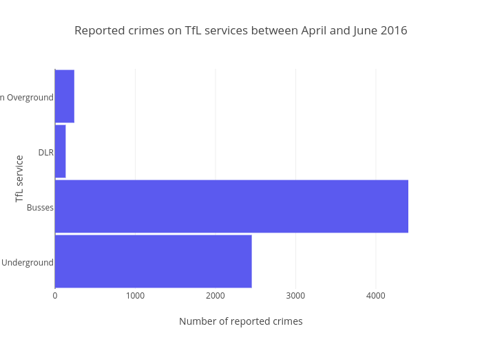
Alexhurrell's interactive graph and data of "Reported crimes on TfL services between April and June 2016" is a bar chart, showing B; with Number of reported crimes in the x-axis and TfL service in the y-axis.. The x-axis shows values from 0 to 4635.789473684211. The y-axis shows values from -0.5 to 3.5.