Edit chart
Loading graph
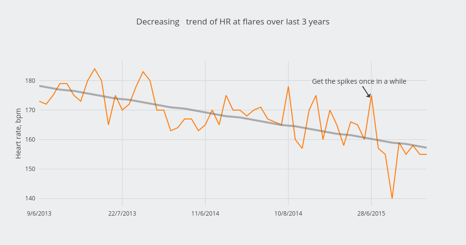
Alexandraserebrennikova's interactive graph and data of "Decreasing trend of HR at flares over last 3 years" is a scatter chart, showing Col2 vs Col2 - fit; with Heart rate, bpm in the y-axis. The x-axis shows values from 0 to 56. The y-axis shows values from 137.55555555555554 to 186.44444444444446. This visualization has the following annotation: Get the spikes once in a while