Edit chart
Loading graph
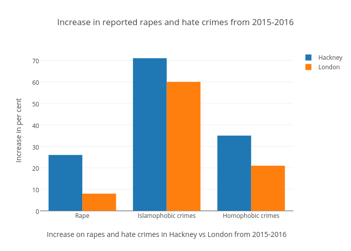
Amandaternblad's interactive graph and data of "Increase in reported rapes and hate crimes from 2015-2016" is a bar chart, showing Hackney vs London; with Increase on rapes and hate crimes in Hackney vs London from 2015-2016 in the x-axis and Increase in per cent in the y-axis.. The x-axis shows values from -0.5 to 2.5. The y-axis shows values from 0 to 74.73684210526316.