Edit chart
Loading graph
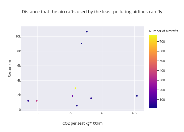
Andreascalisi's interactive graph and data of "Distance that the aircrafts used by the least polluting airlines can fly" is a scatter chart; with CO2 per seat kg/100km in the x-axis and Sector km in the y-axis.. The x-axis shows values from 4.753986536504854 to 6.6386487034951465. The y-axis shows values from -88.8584218196961 to 11310.858421819696.