Edit chart
Loading graph
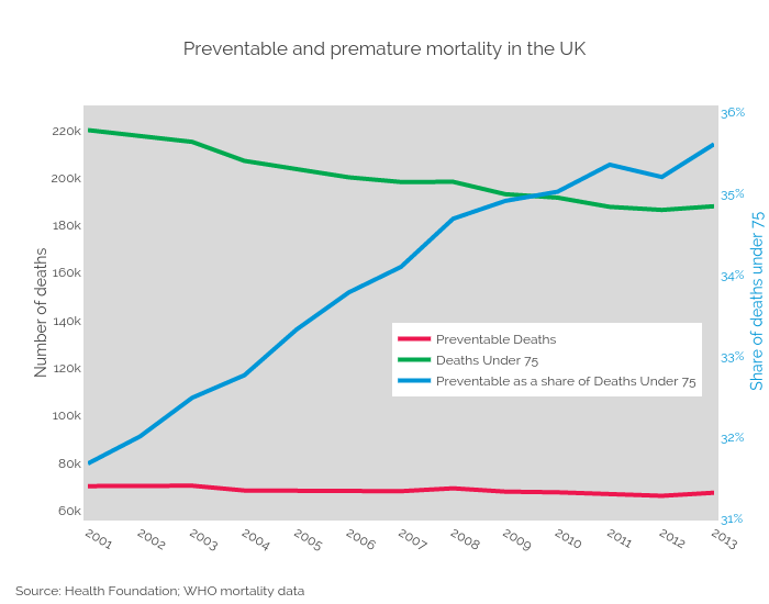
Bengershlick's interactive graph and data of "Preventable and premature mortality in the UK" is a line chart, showing Preventable Deaths, Deaths Under 75, Preventable as a share of Deaths Under 75; with Number of deaths in the y-axis. The x-axis shows values from 2001 to 2013. The y-axis shows values from 56714.944444444445 to 227676.05555555556. This visualization has the following annotations: Share of deaths under 75; Source: Health Foundation; WHO mortality data