Edit chart
Loading graph
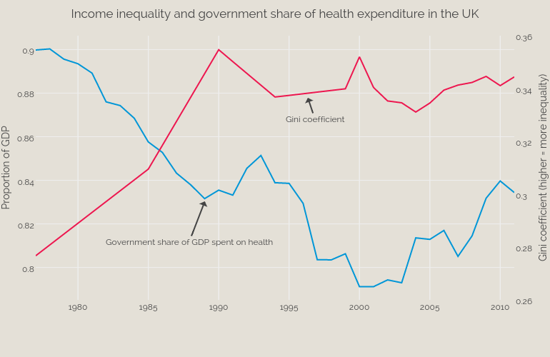
Bengershlick's interactive graph and data of "Income inequality and government share of health expenditure in the UK" is a scatter chart, showing Gini vs Government Share; with Proportion of GDP in the y-axis. The x-axis shows values from 1977 to 2011. The y-axis shows values from 0.7851388888888889 to 0.9063611111111111. This visualization has the following annotations: Government share of GDP spent on health; Gini coefficient