Edit chart
Loading graph
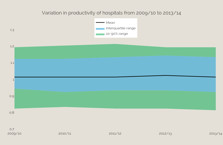
Bengershlick's interactive graph and data of "Variation in productivity of hospitals from 2009/10 to 2013/14" is a filled line chart, showing 90th -10th percentile, 10-90% range, Interquartile range, 10th percentile, Mean . The x-axis shows values from 0 to 4. The y-axis shows values from 0.7 to 1.3.