Edit chart
Loading graph
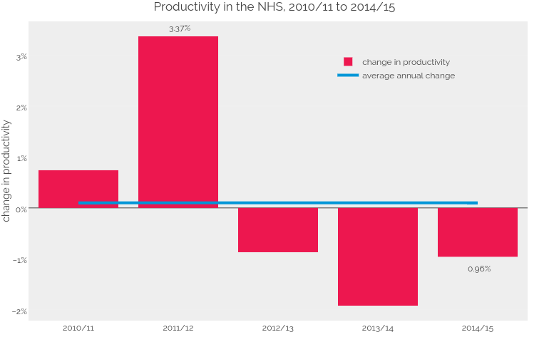
Bengershlick's interactive graph and data of "Productivity in the NHS, 2010/11 to 2014/15" is a bar chart, showing change in productivity vs average annual change; with change in productivity in the y-axis. The x-axis shows values from -0.5 to 4.5. The y-axis shows values from -2.213888888888889 to 3.663888888888889. This visualization has the following annotations: 3.37%; 0.96%