Edit chart
Loading graph
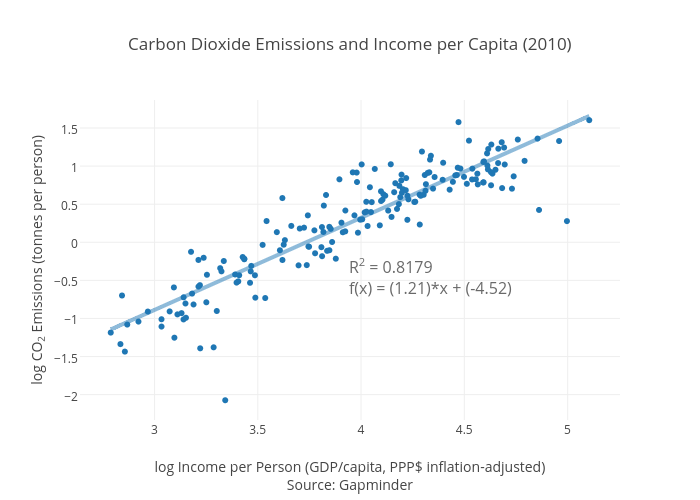
Dana.short's interactive graph and data of "Carbon Dioxide Emissions and Income per Capita (2010)" is a scatter chart, showing CO2/capita vs CO2/capita - fit; with log Income per Person (GDP/capita, PPP$ inflation-adjusted)Source: Gapminder in the x-axis and log CO2 Emissions (tonnes per person) in the y-axis.. The x-axis shows values from 2.645507281889781 to 5.247270035110218. The y-axis shows values from -2.321598611068222 to 1.866981218690535. This visualization has the following annotation: R2 = 0.8179f(x) = (1.21)*x + (-4.52)