Edit chart
Loading graph
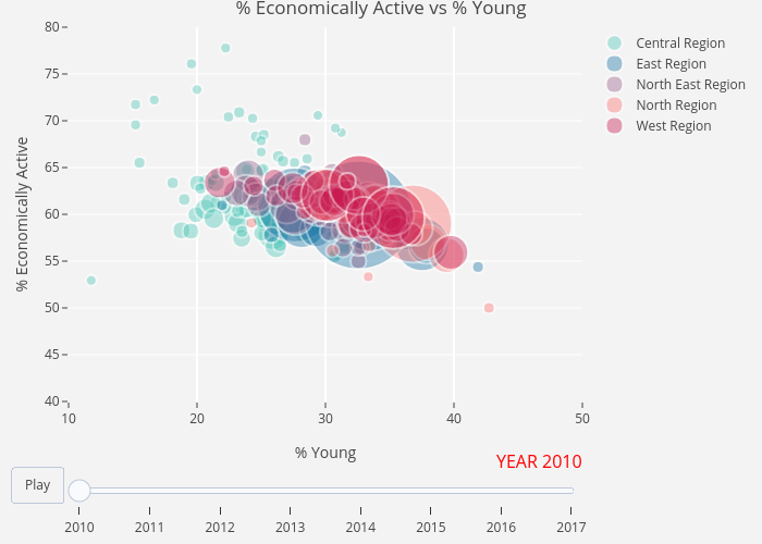
Davidten's interactive graph and data of "% Economically Active vs % Young" is a scatter chart, showing Central Region, East Region, North East Region, North Region, West Region; with % Young in the x-axis and % Economically Active in the y-axis.. The x-axis shows values from 10 to 50. The y-axis shows values from 40 to 80.