Edit chart
Loading graph
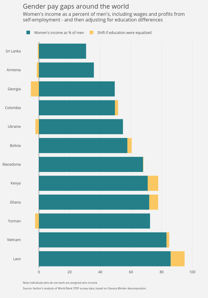
Divyanshi's interactive graph and data of "Women's income as % of men vs Shift if education were equalized" is a , showing Women's income as % of men vs Shift if education were equalized. The x-axis shows values from 0 to 0. The y-axis shows values from 0 to 0. This visualization has the following annotations: Note individuals who do not work are assigned zero income; Source: Author's analysis of World Bank STEP survey data, based on Oaxaca-Blinder decomposition; Gender pay gaps around the world; Women's income as a percent of men's, including wages and profits from; self-employment - and then adjusting for education differences