Edit chart
Loading graph
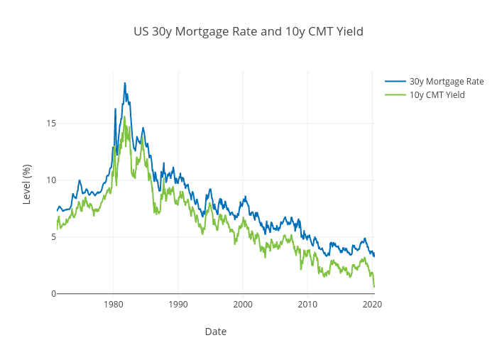
Ecincotta's interactive graph and data of "US 30y Mortgage Rate and 10y CMT Yield" is a scatter chart, showing 30y Mortgage Rate vs 10y CMT Yield; with Date in the x-axis and Level (%) in the y-axis.. The x-axis shows values from 0 to 0. The y-axis shows values from 0 to 0.