Edit chart
Loading graph
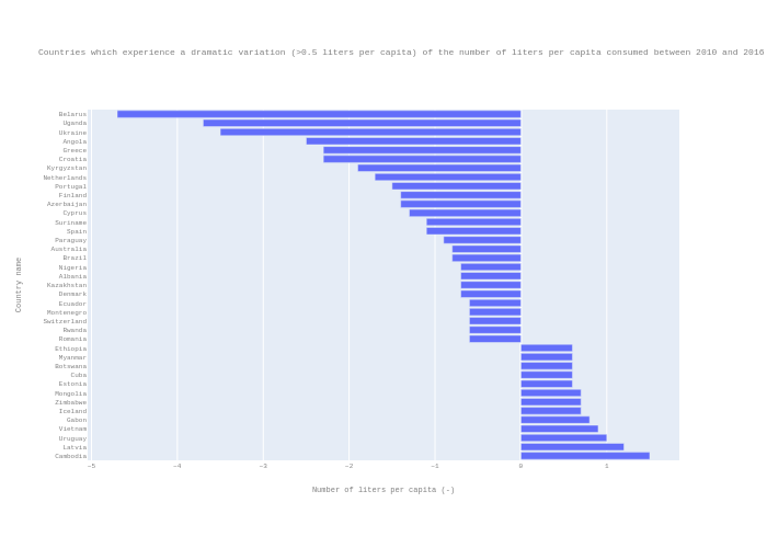
Epflturner's interactive graph and data of "Countries which experience a dramatic variation (>0.5 liters per capita) of the number of liters per capita consumed between 2010 and 2016" is a bar chart; with Number of liters per capita (-) in the x-axis and Country name in the y-axis.. The x-axis shows values from 0 to 0. The y-axis shows values from 0 to 0.