Edit chart
Loading graph
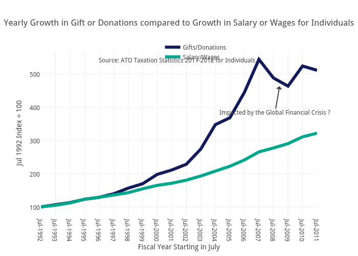
Feliperego's interactive graph and data of "Yearly Growth in Gift or Donations compared to Growth in Salary or Wages for Individuals" is a scatter chart, showing Gifts/Donations vs Salary/Wages; with Fiscal Year Starting in July in the x-axis and Jul 1992 Index = 100 in the y-axis.. The x-axis shows values from 0 to 19. The y-axis shows values from 75.36088166111111 to 568.1432484388889. This visualization has the following annotations: Source: ATO Taxation Statistics 2011-2012 for Individuals; Impacted by the Global Financial Crisis ?