Edit chart
Loading graph
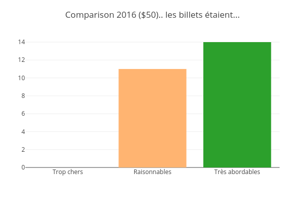
Jodymcintyre's interactive graph and data of "Comparison 2016 ($50).. les billets étaient..." is a bar chart, showing E, F, G. The x-axis shows values from -0.5 to 2.5. The y-axis shows values from 0 to 14.736842105263158.