Edit chart
Loading graph
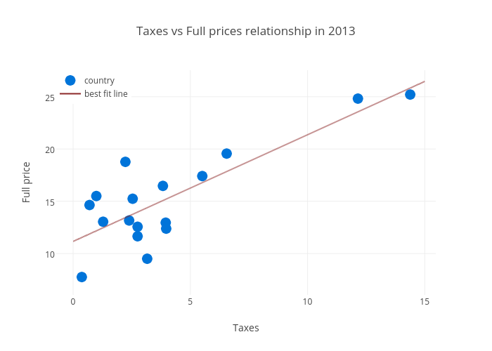
Justglowing's interactive graph and data of "Taxes vs Full prices relationship in 2013" is a scatter chart, showing country vs best fit line; with Taxes in the x-axis and Full price in the y-axis.. The x-axis shows values from 0 to 0. The y-axis shows values from 0 to 0.