Edit chart
Loading graph
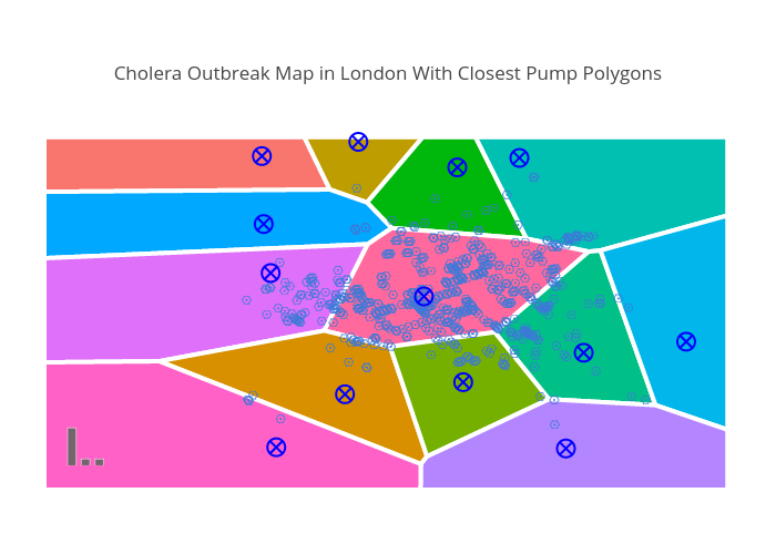
Mattsundquist's interactive graph and data of "Cholera Outbreak Map in London With Closest Pump Polygons" is a line chart, showing Street, #F8766D.1, #BD9D00.2, #00B70B.3, #00C0B2.4, #00A8FF.5, #DF70F9.6, #FF699D.7, #D89000.8, #75AF00.9, #00C088.10, #00B6EA.11, #B385FF.12, #FF61C6.13, Death, Pump, Pump Regions. The x-axis shows values from 3.39 to 19.912001. The y-axis shows values from 2.3622428406590337 to 19.817384027478358.