Edit chart
Loading graph
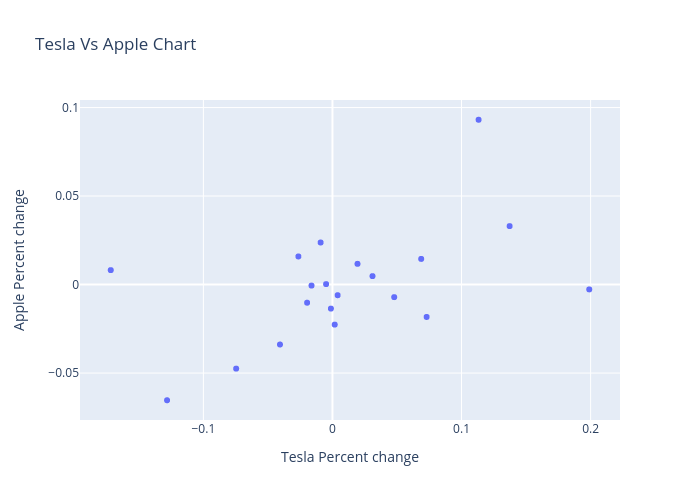
Quantra_content's interactive graph and data of "Tesla Vs Apple Chart" is a scatter chart; with Tesla Percent change in the x-axis and Apple Percent change in the y-axis.. The x-axis shows values from 0 to 0. The y-axis shows values from 0 to 0.