Edit chart
Loading graph
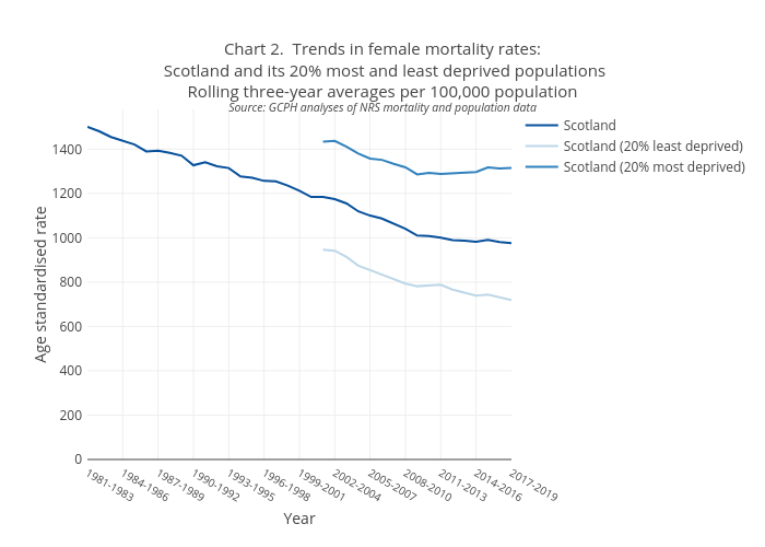
Scotpho's interactive graph and data of "Chart 2. Trends in female mortality rates: Scotland and its 20% most and least deprived populationsRolling three-year averages per 100,000 populationSource: GCPH analyses of NRS mortality and population data" is a line chart, showing Scotland, Scotland (20% least deprived), Scotland (20% most deprived); with Year in the x-axis and Age standardised rate in the y-axis.. The x-axis shows values from 0 to 0. The y-axis shows values from 0 to 0.