Edit chart
Loading graph
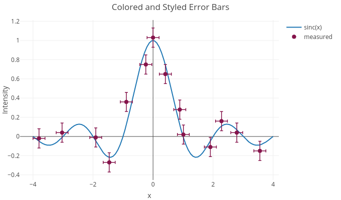
Tanisukegoro's interactive graph and data of "Colored and Styled Error Bars" is a line chart, showing sinc(x) vs measured; with x in the x-axis and Intensity in the y-axis.. The x-axis shows values from -4.431111111111111 to 4.191111111111112. The y-axis shows values from -0.4533333333333333 to 1.2133333333333334.