Edit chart
Loading graph
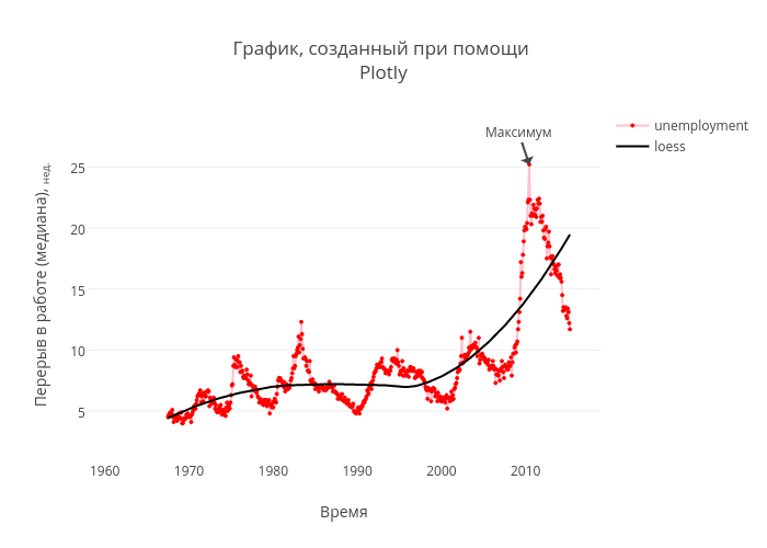
_statist_'s interactive graph and data of "График, созданный при помощи Plotly" is a line chart, showing unemployment vs loess; with Время in the x-axis and Перерыв в работе (медиана), нед. in the y-axis.. The x-axis shows values from -380527266089.12256 to 1542321832670.4053. The y-axis shows values from 0.9641938177661817 to 29.694963263208564. This visualization has the following annotation: Максимум