0
1
2
3
0
1
2
3
0
1
2
3
0
1
2
3
−1
−0.5
0
0.5
1
0
1
2
3
1
2
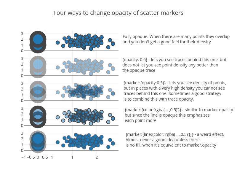
Four ways to change opacity of scatter markers
Fully opaque. When there are many points they overlap
and you don't get a good feel for their density
{opacity: 0.5} - lets you see traces behind this one, but
does not let you see point density any better than
the opaque trace
{marker:{opacity:0.5}} - lets you see density of points,
but in places with a very high density you cannot see
traces behind this one. Sometimes a good strategy
is to combine this with trace opacity.
{marker:{color:'rgba(....,0.5)'}} - similar to marker.opacity
but since the line is opaque this emphasizes
each point more
{marker:{line:{color:'rgba(....,0.5)'}}} - a weird effect.
Almost never a good idea unless there
is no fill, when it's equivalent to marker.opacity
plotly-logomark
Edit chart
Alex's interactive graph and data of "Four ways to change opacity of scatter markers" is a scatter chart, showing trace 0, trace 1, trace 2, trace 3, trace 4, trace 5, trace 6, trace 7, trace 8, trace 9. The x-axis shows values from -1 to 1. The y-axis shows values from -0.6705426356589166 to 3.670542635658917. This visualization has the following annotations: Fully opaque. When there are many points they overlapand you don't get a good feel for their density; {opacity: 0.5} - lets you see traces behind this one, butdoes not let you see point density any better thanthe opaque trace; {marker:{opacity:0.5}} - lets you see density of points,but in places with a very high density you cannot seetraces behind this one. Sometimes a good strategyis to combine this with trace opacity.; {marker:{color:'rgba(....,0.5)'}} - similar to marker.opacitybut since the line is opaque this emphasizeseach point more; {marker:{line:{color:'rgba(....,0.5)'}}} - a weird effect.Almost never a good idea unless thereis no fill, when it's equivalent to marker.opacity