Edit chart
Loading graph
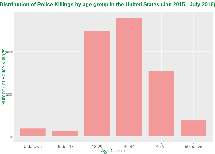
Allenkunle's interactive graph and data of " Distribution of Police Killings by age group in the United States (Jan 2015 - July 2016) " is a bar chart; with Age Group in the x-axis and Number of Police Killings in the y-axis.. The x-axis shows values from 0.4 to 6.6. The y-axis shows values from -27.9 to 585.9.