Edit chart
Loading graph
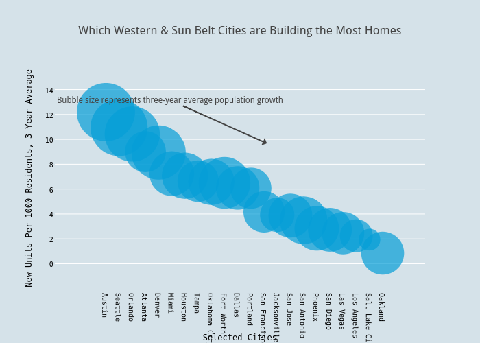
Andy_keatts's interactive graph and data of "Which Western & Sun Belt Cities are Building the Most Homes" is a scatter chart, showing Units Per 1000 3-Year Average; with Selected Cities in the x-axis and New Units Per 1000 Residents, 3-Year Average in the y-axis.. The x-axis shows values from -2.253684167229729 to 22.992957066320063. The y-axis shows values from -0.8257498551677686 to 14.194304748601889. This visualization has the following annotation: Bubble size represents three-year average population growth