Edit chart
Loading graph
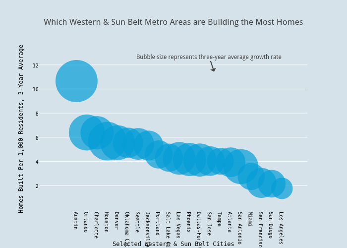
Andy_keatts's interactive graph and data of "Which Western & Sun Belt Metro Areas are Building the Most Homes" is a scatter chart, showing Three Year Units per 1000 Average; with Selected Western & Sun Belt Cities in the x-axis and Homes Built Per 1,000 Residents, 3-Year Average in the y-axis.. The x-axis shows values from -3.179004620039306 to 22.242038574922518. The y-axis shows values from -0.5902659796452445 to 14.297751063390924. This visualization has the following annotation: Bubble size represents three-year average growth rate