Edit chart
Loading graph
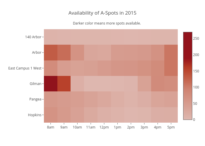
Ayatamin's interactive graph and data of "Availability of A-Spots in 2015" is a heatmap. The x-axis shows values from -0.5 to 9.5. The y-axis shows values from -0.5 to 5.5. This visualization has the following annotation: Darker color means more spots available.